We will import `retail-analytics.csv` into your AI tool and use it with Luminon.
Use Luminon, import `retail-analytics.csv` into a dataset and create the dashboard `Retail Analytics Overview` and the following charts in this order:
- `Bar chart` `Revenue by Category` (sum `revenue` by `category`)
- `Donut chart` `Revenue Share` (sum `revenue` by `country`)
- `KPI card` `Total Revenue` (sum total `revenue`)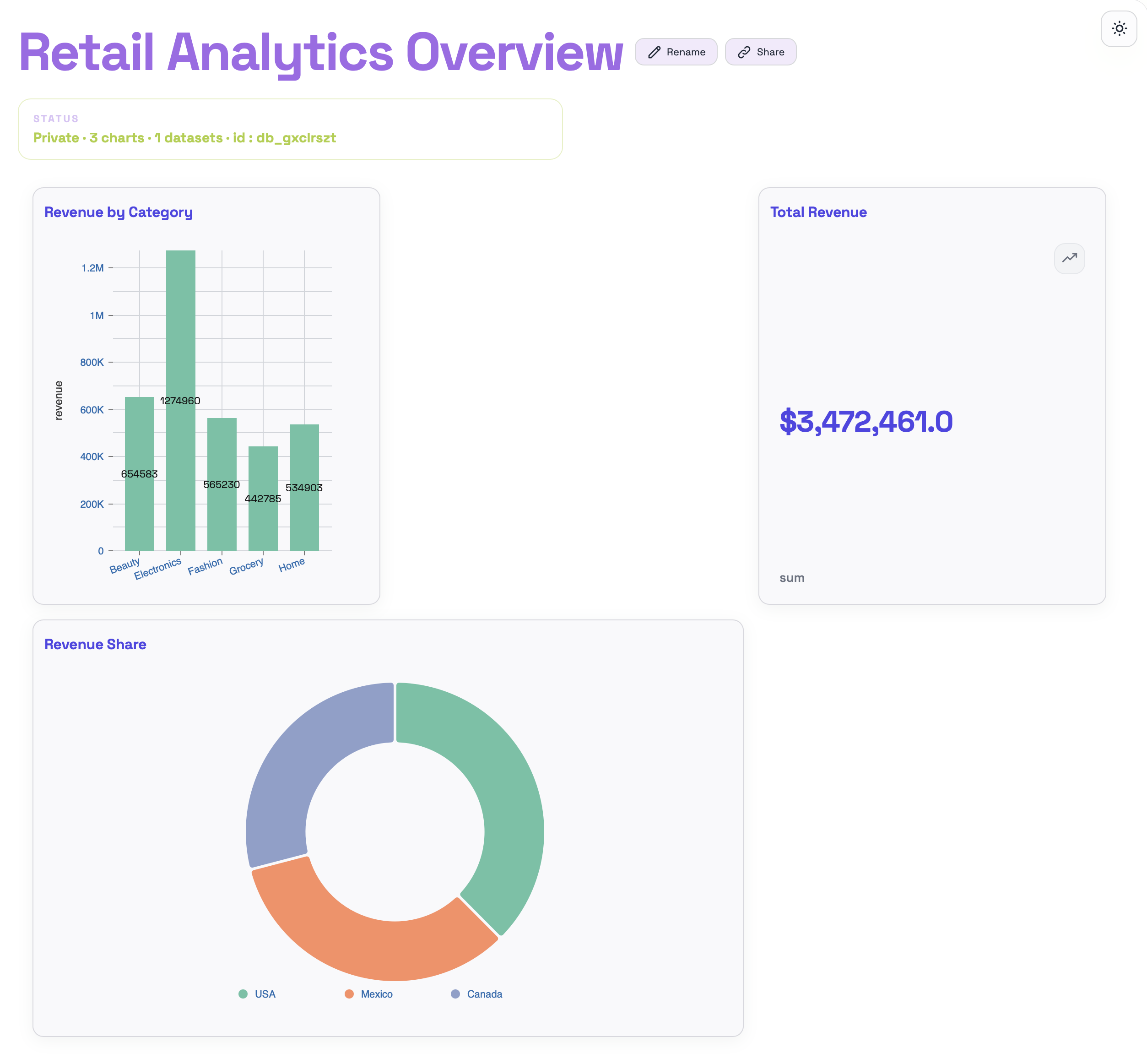
First we create the dashboard and the visuals. In the next step we will arrange them in a simple way.
Adjust `Retail Analytics Overview` to `3` columns:

- `Revenue by Category` on the left and spans `2` columns
- `Revenue Share` on the right and spans `1` column
- `Total Revenue` below on the left and spans `1`
- All charts occupy only one row.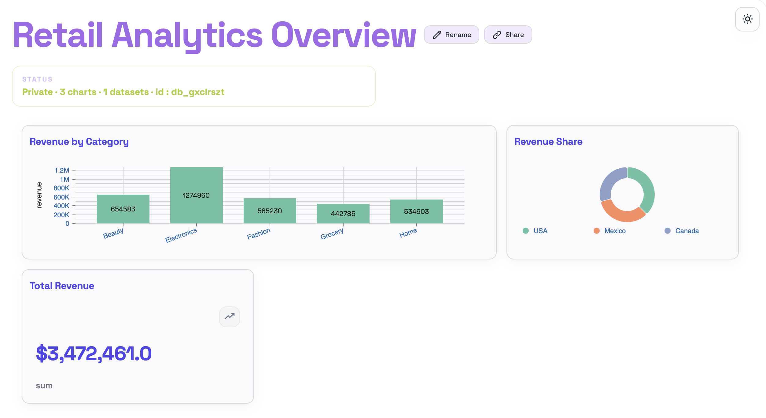
The idea is simple: one large chart on the left, one small chart on the right, and the card below. That keeps the result easy to follow.
Add `Monthly Revenue` as a `Line chart` on the same dataset (sum `revenue` by `month`).
Place it next to the `Total Revenue` `KPI card` and make it span `2` columns.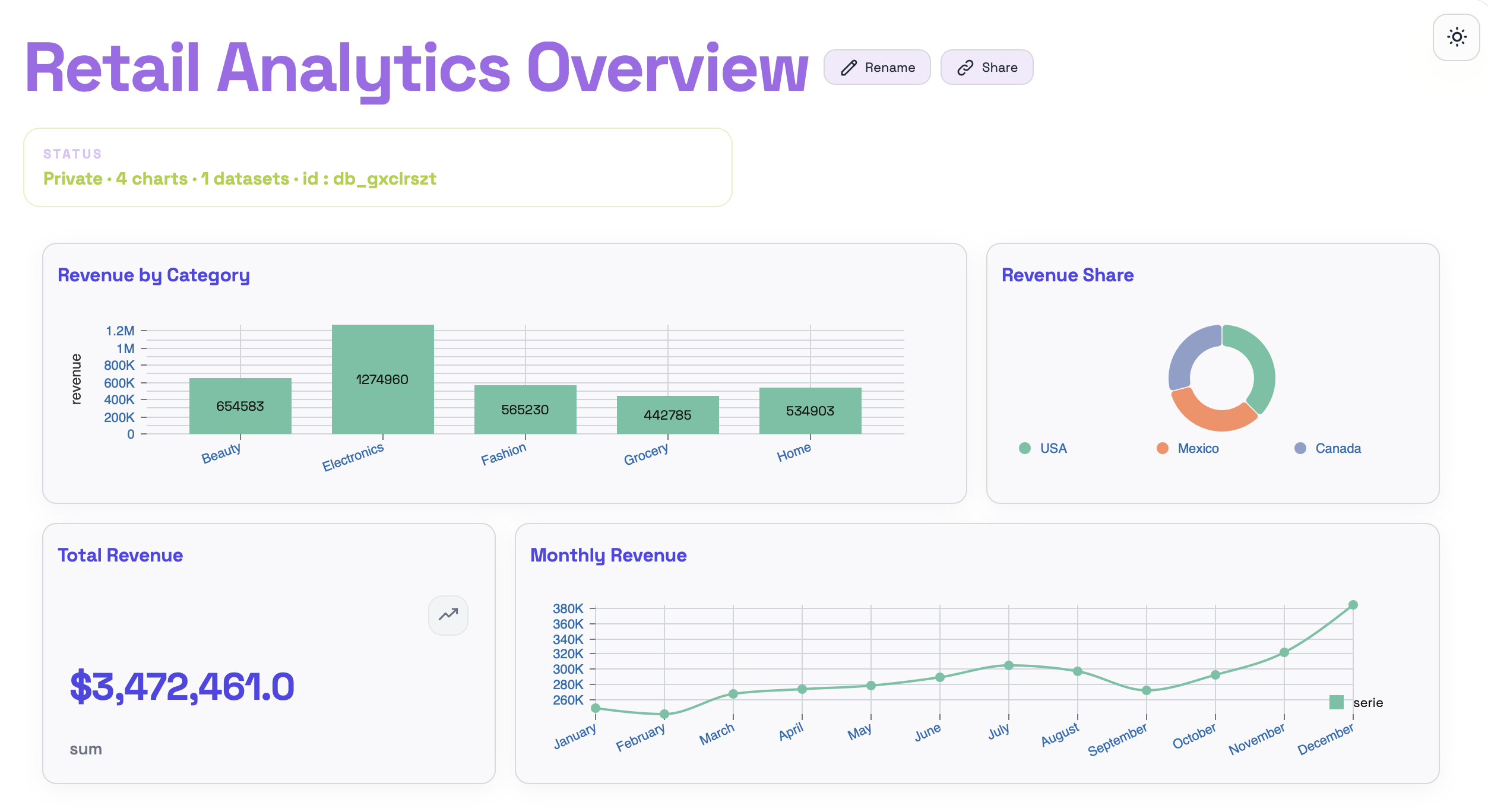
With this last prompt we complete the top row and leave the dashboard ready for the next adjustment.
In the next section we will add filters to the dashboard to make it interactive.